


ISSP 2025 kalendermärkmik: funktsionaalsuse ja loomingulisuse kohtumispaik


ISSP kalendermärkmikus on ruumi märkmetele, nimekirjadele ning nädalate ja päevade planeerimisele. See on igapäevane kaaslane, mis sütitab inspiratsiooni. Loe lähemalt, kuidas märkmik sündis (ing. k).
ISSP kalendermärkmikus on ruumi märkmetele, nimekirjadele ning nädalate ja päevade planeerimisele. See on igapäevane kaaslane, mis sütitab inspiratsiooni. Loe lähemalt, kuidas märkmik sündis (ing. k).
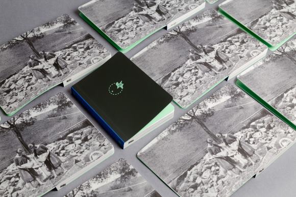
Traditionally, the ISSP Weekly Planner combines the functions of a planner, a bullet journal and a notebook, and is a perfect daily companion for those enjoying handwritten notes of all kinds.
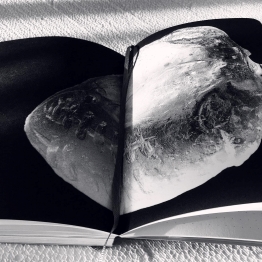
The Weekly Planner 2025 features 40 carefully selected photographies by 28 Latvian and international authors: Agnese Madžule, Alessandro Truffa, Anna Dzērve, Britta Baumann, Caitlin E. Littlewood, Céline Gobillard, Cemil Batur Gökçeer, Eltaj Zeynalov, Emilia Martin, Eva Gjaltema, Evija Pintāne, Guido Gazzilli, Herta Krūmiņa, Hilda Lindström, Imants Aurora Daksis, Krista Dzudzilo, Kristina Mos, Lavinia Parlamenti, Leonardo Taddei, Michele Quondam Pasquale, Nanna Hammer Tiittanen, Nicola Russo, Olia Koval, Ronit Porat, Sanna Larmola, Valdis Putniņš, Viviana Bonura, Zanda Puče.
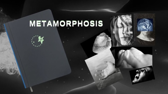
Theme of 2025: Metamorphosis
From the Latin meta (to change), morphosis (form), metamorphosis, a powerful symbol of transformation, reflects one aspect of the psyche's encounter with its development: a radical change in form, function, character and state of being.
Planner inside content:
– 12 monthly openings with a selection of images, yearly calendars;
– 53 weekly openings with space for notes, international holidays, Latvian name days;
– 90-page notebook for personal notes;
– 40 original photographies;
– An envelope for storing important things at the end of the planner.
Brand owner: ISSP
Creative Director: Julija Berkovica
Design: Artis Briedis, rabit!!
Production: JELGAVAS TIPOGRĀFIJA, Riga Prints SIA
Published in partnership with Antalis AS and VV Foundation
Printed on premium materials: Olin Design Regular Soft White 100 gsm, Olin Colours Spring Green 200 gsm, Corvon® Mano Grey, and Wicotex Brillianta
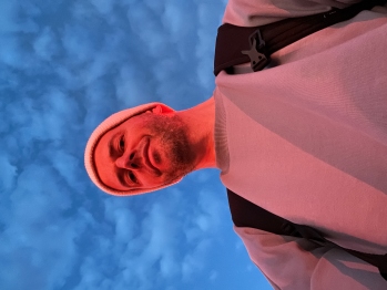
Interview : Creative director Julija Berkovica
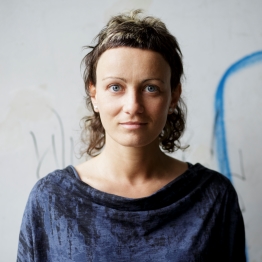
Photo by Andrejs Strokins
Antalis: Please tell us a little about the history of the ISSP planner ?
Julija: The ISSP planner evolved from our old big project International Summer School of Photography workbook. At one point, we realized that we would like to create not a formal catalog, but something for everyday use, using great pictures created by the participants. The planner was published for the first time in 2013, in partnership with the Kuldīga County Council, in the first years it was created from photographs created by the participants of the summer school during the event in Kuldīga. 2021. We reassessed the content and for the first time announced the international Open Call for pictures on the topic "Natural Phenomena". Since then, every year has its own theme and photos are selected by competition.
Antalis : Please tell us about the ISSP planner 2025 and team to make project happen.
Julija: This year theme is metamorphoses and we received more than 1000 photos from 140 authors in the competition. The geographical coverage is very wide - 38 countries from literally all 6 continents. Since 2022, the content of the planner has changed - following the principles of the 'bullet journal', weekly layouts were joined by monthly layouts, and a notebook section for personal notes was added to the publication. Throughout the years, Antalis remained with us as a partner, so together with the partnership with the publication's designer Artis Briedis, there is one stable partnership!
Antalis: The planner is ready in November-December, but when did you and your team start working on the project? Please tell about the main steps from an idea to the finished planner.
Jūlija: We start thinking about the planner at the end of spring - beginning of summer. The first step is to make sure that all partners of the publication are still "in" and want to continue cooperation, do they see any changes in the format, etc. We talked with Artis about the design, production plan and started formulating the theme of the year. The Open Call for photos is announced in August and the photos are selected in September. Then the designer also works on the layout. So far, the most difficult part of creating the edition has been the production itself - it takes place in five stages as the material travels back and forth between the printing house, the post-printing company and the screen printers, which is a planning and logistical challenge. Every year we want to start this process sooner, but in the end everything happens as usual - in November.
Antalis: Who are the users of your planner – who waiting the new issue?
Julija: Above all, me and my ISSP colleagues – the majority of the team use the planner themselves on a daily basis, and all changes come from their own experience and needs. Basically, we do it for ourselves and sometimes for others too! The planner has many regular users who wait for the edition every year. It seems to me that these are people who like modern photography and ascetic design, and of course those who still like to structure their thoughts and works with the help of paper and pen. These are our colleagues and students, but also people who are completely unrelated to art but appreciate the publication's inspiring spirit, ease of use and tasteful and thoughtful design.
Interniew : Designer Artis Briedis
Antalis: How many years have you been an ISSP planner designer?
Artis: We have been cooperating since the very beginning of ISSP in 2006. I have always tried to complement ISSP's well-kept "photo field" with appropriate graphics design and printing. I have built all iterations of the planner.
____
Antalis: Who made the decisions about the use of photos in the calendar and how? Who chooses the thema - you? The whole team?
Artis: The thema is chosen and the basic editorial selection of photographies is carried out by the ISSP. In the process, we compare opinions and participate consultatively as necessary.
Antalis: Is it easy to create a planner again and again, year after year?
Artis: Easy and a bit hard at the same time. Easily because the process has become a kind of annual tradition that most of the processes are well known. It is often more difficult to find new zeal in the "designer's internal competition", which is necessary to find and give the publication a spark of freshness every year.
I like the approach created to use the elements of the ISSP logo stripes for the design of the cover print, with the aim of creating an unprecedented graphic sign corresponding to the theme of the planner.
Antalis: Of course, we would like to know more about the decisions regarding the use of materials for inside pages, covers. We know it's you who chooses it - tell us…
Artis: Aesthetic, durability and quality aspects are very important when choosing materials. In order to ensure lightness and durability, it is important that the paper of the inner pages is sufficiently thin, light, but at the same time allows you to make notes and "tolerate" photo reproductions – exactly like Olin Design Regular Soft White. The color of the front pages is part of the design of the planner and it's nice that the Olin Colors range offers a great selection. Corvon Mano and Wicotex Brillianta cover and binding have been tested for durability and good print quality options.
Antalis: an the last question - If there will be no restrictions (financial) on the use and production of materials - do you have a dream design & printing project that you would like to realize?
Artis: This could be a very long list. The daily work of a graphic and printing designer is very often affected by such restrictions. Although complete (financial) freedom is a great temptation, experience shows that it is not always decisive for a great work result. Working with limited resources can also sometimes be the basis for the creation of great ideas.
One of my dream projects is the creation of very compact, small (in terms of format), but rich in content and also in typography effective books.
Antalis: Thank You so much, Artis!


